
Tuesday, June 20, 2006
The italk2much Aftermath
*** Small Talk I was away for the NEC flower show when IT2M reviewed my blog. I did not know of the review until I returned home on 20th June. This is written in reply to their wonderful review. I have changed the layout and design, fixed the pop up window etc, as suggested by IT2M team. They in return, have taken heed of my suggestion to include a legend detailing their smacks etc. How they did not think about it is beyond me. I have been banned from commenting on their site. Hence I do not see any reason why any of their bitches should be allowed to speak here. I will no longer mention them, beyond the three posts I wrote about them. I have moved on and it is time they do so too. *** ~ A Little Less Conversation, Elvis vs JXL *** On A More Serious Note Thanks to Charles, who pointed me to a more visually appetizing (and free) blog skin site. Generally I much prefer a centralized content with the navigation bar on its right side. I also much MUCH prefer a white background. Does anyone feel the same? 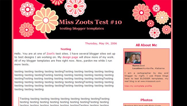 What do you think of this black/red/flower design? I kinda like it but I am unsure how long I can take the flowers. Never really saw myself as a "sweet" person. What do you think of this black/red/flower design? I kinda like it but I am unsure how long I can take the flowers. Never really saw myself as a "sweet" person.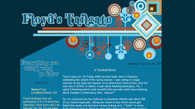 On the other hand, I also found this geometric shape mobile thingy rather interesting, with the exception that the background ain't white and the navigation bar is over on the left.... On the other hand, I also found this geometric shape mobile thingy rather interesting, with the exception that the background ain't white and the navigation bar is over on the left....*argh!* *pulls hair* *thinks of catching Tits in the garden and toasting them on a BBQ* *thinks of ways to catch fat squirrels stealing from my bird table, turning them into a warm duvet* HELP! *** Now you cannot call The Nude a whiny child, sulking over the negative comments on italk2much.com. I have actually taken heed to some of the comments raised over that site when About Nude Not Naked was being appraised. And here to show that I am not a whiny child, who is feeling a little sour grape over the bad report, here is some effort on my part to better my blog. What do you think of the new layout and design? I'm still shopping for a nicer design but I guess this is better than the previous, right? Do tell me what you guys think, ok. I am sure that you have noticed that there are some hiccups in this new layout. My header ran out of the space it was supposed to be confined. I have ran through the html and I don't seem to be able to find what is wrong with it. Similarly I am having problem getting rid of the flower icon located next to the first title of this post. And there is this annoying "skin design" word sandwiched between the main post and the navigation bar. Right at the bottom, you will also notice the overlapping icons from the designer where I knicked this layout from. Can someone please help me? Pretty please? Much appreciate any help and pointers. p/s: Can someone tell me how the blog loads up in their browsers? I am using a Safari and nothing pops up in mine. Anyone else? *** Since Marcus and GB will be ever so gallantly helpful, I have decided to move back to the old layout........ less I get more boots and fishes from this layout *haha* *** Some other choices for the layout design are: 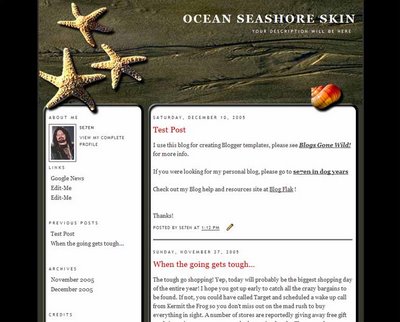 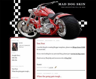 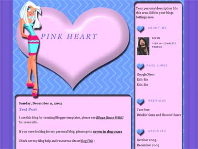 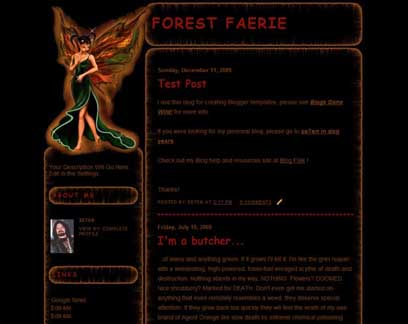 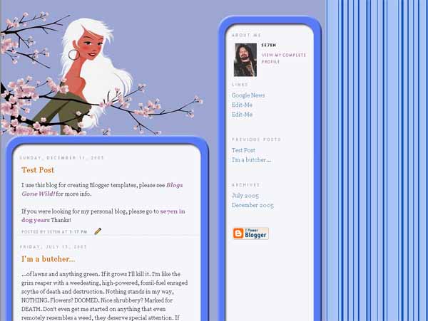 Labels: Etc |
The site title is over-running the right sidebar. And I see the flower icon too.
Besides that, the stripey graphics on either side is kinda distracting. I would replace them with just the nice pink.
I can help you with the template if you copy and mail it to me. :)
You - have - got - to be kidding.
Well I do like the fact that the whole thing is centered instead of the previous which was aligned to the left, I think.
Am in no mood to play troll today. Not especially since I had to crack my head to figure all those nasty stuff to vomit at Charred's hairy face.
Will chat with Mooiness over MSN and perhaps email soon....
Thanks guys.
The message box of the tag board is too wide. Adjust :)
It's kinda messy now..
btw to remove the flower.. look at your source code.. search for
/* Headings
----------------------------------------------- */
h2 {
background:#fff url("http://i58.photobucket.com/albums/g243/freetemplates3/scrollh2bg.gif");
background-repeat:no-repeat;
background-position:center left;
width:190px;
height:50px;
margin:-10px 0 -10px 0;
padding-top:20px;
font:100% "Trebuchet MS",Trebuchet,Arial,Verdana,Sans-serif;
text-transform:uppercase;
font-weight:strong;
letter-spacing:.2em;
text-align:center;
color:#333;
}
Delete the bold part, should done the job.
Header title size too big.. have to reduce the size.
Search for this code..
#blog-title {
margin:0;
padding:80px 0 0 80px;
font:240% Georgia, "Trebuchet MS", Arial, Sans-Serif;
line-height:1.4em;
font-style:italic;
color:#ffcccc;
text-transform:uppercase;
letter-spacing:.2em;
text-align:left;
}
Just change the % of the bold part until it fits.
Gah! My eyes. Too many vertical lines >.<
Looks like you've already got all the help you need so I'll just head on back where I came from. Good luck with the layout. If you need anything, you know where to find me.
Go JXL!!
Sorry just some dutch pride playing up. :)
A bit messy for my taste....especially the lines in the background (giving me headache oh)... and i think the content area can be wider, not many people uses 800x600 resolution anymore... but it's just my 2 cents...
Oh gosh, and I thought I entered some cult page by mistake. First of all, I have to highlight the words to read them. Your white background just vanished! Secondly, vertical stripes got me into severe hypnosis - "Repeat after me, Otto's new page layout is aaawwwweeeesssooommmeee... Now say it"
In all honesty, mind keeping your old one until you get a much reader-friendly layout? Marcus is helping you as we speak, I believe.
On a last note, I give you three smacks and two boots for your new layout. (Actually I don't even know WTF these smacks and boots mean)
Nicholas
Hey! I thought I'd catch you in NEC last week during the Gardener's World Live, babe... hhehehehehhee, that was me fantasizing anyway...
Jee
Thanks for looking through the html source. I really appreciate your help. And your suggestions worked!!! Many thanks.
GB
I do know where to find ya.... wanna chat on MSN? I'll email you with details soon.
Kuek
Wahhh I don't even knw how to control the resolution.... *sigh* I don't know head from tail when it comes to anything that has to do with computers..... nil skills!
Ian
Wah if only I could hypnotize everyone into reading ANNN! *tsk tsk*
I've changed back to the old layout at your request. I appreciate honesty and I am glad that I have that in you.
I think smacks are good... It's the inverse thingy going on. I don't think hairy balls, fishes or atomic explosion is any good though but hey, I can be thick faced about it.... hehehehehe.....
well all of the designs are really nice. I like the last one. Here are some nice designs as well from different peeps http://blogger-templates.blogspot.com/
and
http://www.zootsdesigns.com/
argh, templates and html, headache invoking!
whats with fat Americans eating oily burgers and cola by the way? did i miss something while i am away?
The flowers and the beach ones have nice colour coordination - those banner images up the top can always be swapped out for something else.
Have fun choosing! :)
Hey, I like flowers but not to the degree of going to some Gardener's Live like somebody :p
Flower flower! My vote is on the flower design.
Well, like what mooiness said, the top banner can always be changed. nothing a little photoshop can't fix. =)
i like the design that you chose from zoot. But I also the like the blue one since I am a blue person.
And regarding to pop ups, I dont get any. (I am using ff, opera and ie)
If you don't like the background colour, you can change it. You can also change the header & footer images. Just host it in photobucket (for example) and link it to your template.
Alright! Where did you get your templates from? I think my blog needs a layout makeover too.
PS: Flower is so you - your pom-poms. So don't bother worrying about whether it suits you. Hahaha!
lol. You got my email? bworkers[at]gmail[dot]com. Free to chat at midnights +8GMT.
I've never been one for designs. K.I.S.S. (not the band) rox.
Charles
Oh I like this design too, Charles. I think it is hyperly beautiful... not quite me but I like the layout and how the font is....
Thank you for helping me sort this out. Much appreciated.
Mooiness & Kuek
I chose the flower design! Yay! So pretty, eh? Hehehehehhe... now Marcus, can you help me arrange the navigation bar? *bats eyes*
Ian
http://www.zootsdesigns.com - it has really nice layouts and designs.
GB
I have it now...... LOL
HI there...I found your site because I've been looking for people who have had similar problems with IT2M that I have had. I've been flamed on two separate occasions, once for something I didn't even DO (someone made snotty comments on their site and used my URL address, but even though they knew the truth they chose not to speak it...VERY despicable.)
I'm glad you bounced back with good humor...great photos, BTW. I love your kitty!
Sudiegirl